How to Coordinate Colors with Your Window Treatments
Choosing the perfect window treatments is more than just picking a style—it’s about creating harmony in your space. Colour coordination plays a crucial role in tying your room together, enhancing the mood, and even influencing how spacious a room feels. Whether you’re redecorating or starting from scratch, this guide will help you navigate the world of colour with confidence.

Understanding Color Theory Basics
Before diving into specific recommendations, let’s cover some fundamental colour concepts. These will help you make informed decisions:
- Color Wheel: The foundation of color theory. It helps identify relationships between colors.
- Complementary Colors: Opposite each other on the wheel (e.g., blue and orange). They create dynamic contrast.
- Analogous Colors: Neighbors on the wheel (e.g., blue, green, and teal). They offer a harmonious and serene look.
- Neutral Colors: Shades like white, gray, beige, and black. They provide balance and flexibility.
With these basics in mind, let’s explore how to apply them to your window treatments.
How to Choose Window Treatment Color
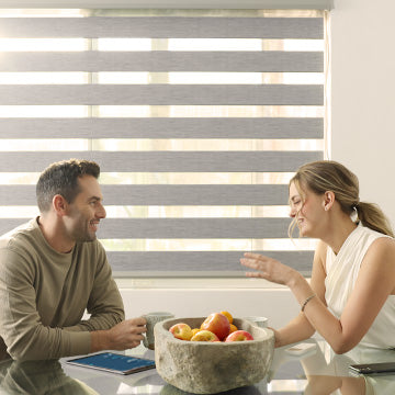
Selecting the right colour for your blinds or curtains depends on several factors: your wall colour, furniture, flooring, and the overall vibe you want to achieve. Here are some practical approaches:
Matching vs. Contrasting with Wall Color
- Matching: Blinds or curtains that match the wall color create a seamless, unified look. This is ideal for making windows blend in and maintaining a minimalist aesthetic.
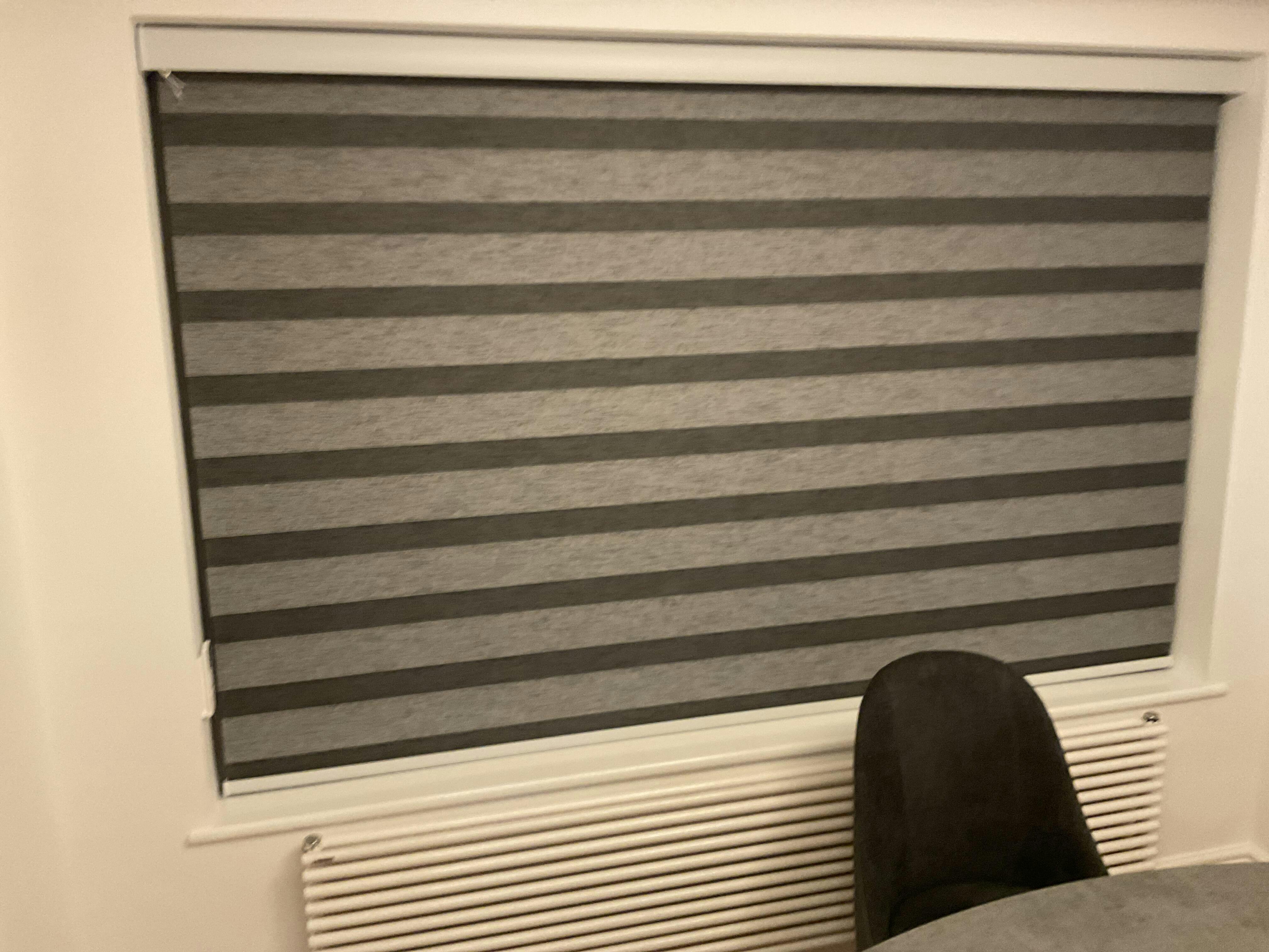
- Contrasting: Choose a color that stands out against the wall to draw attention to the window. For example, dark blinds against light walls can add depth and definition.
Should Blinds Match Trim or Wall Color?
This is a common dilemma. Here's a quick breakdown:
- Match Trim: If your trim is a standout feature (e.g., crisp white crown molding), matching blinds to the trim can create a cohesive, tailored look.
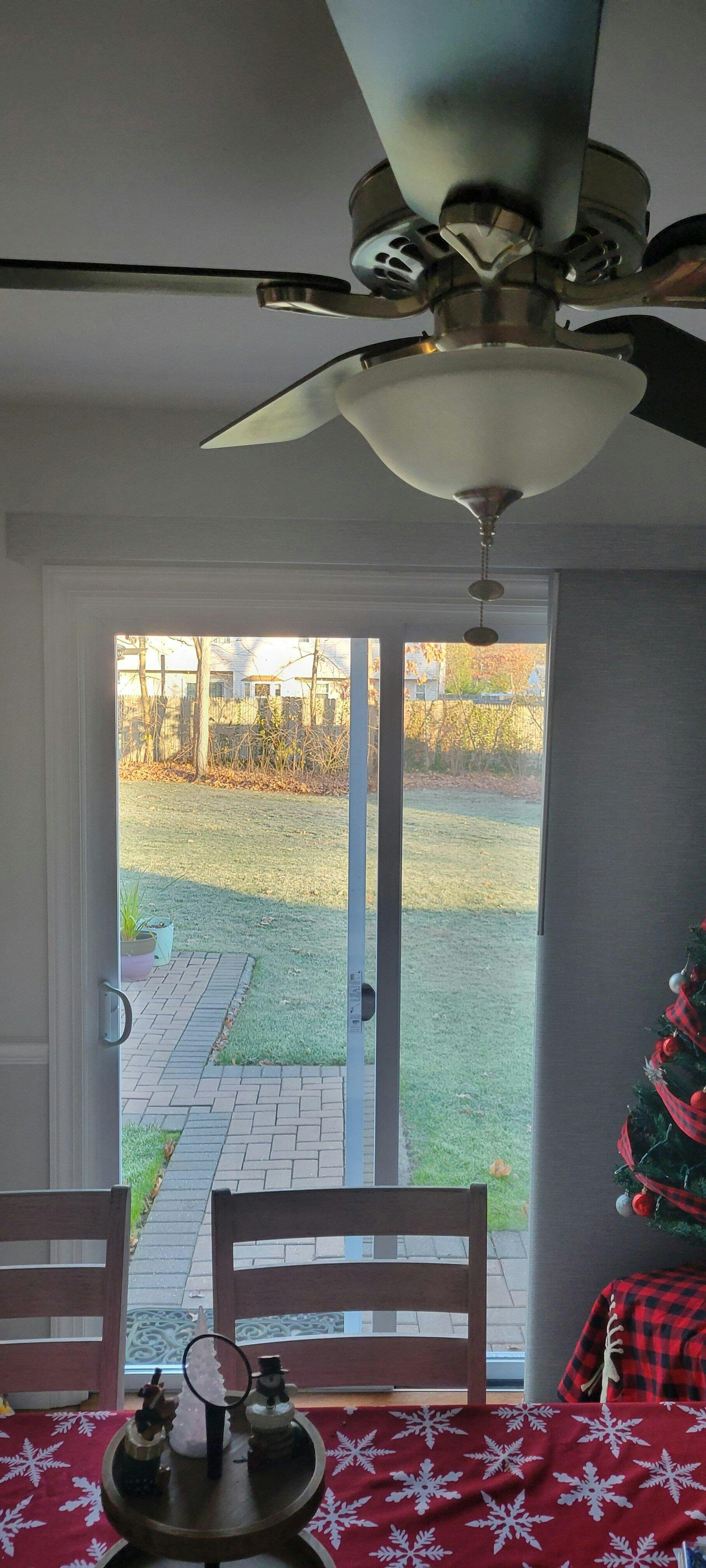
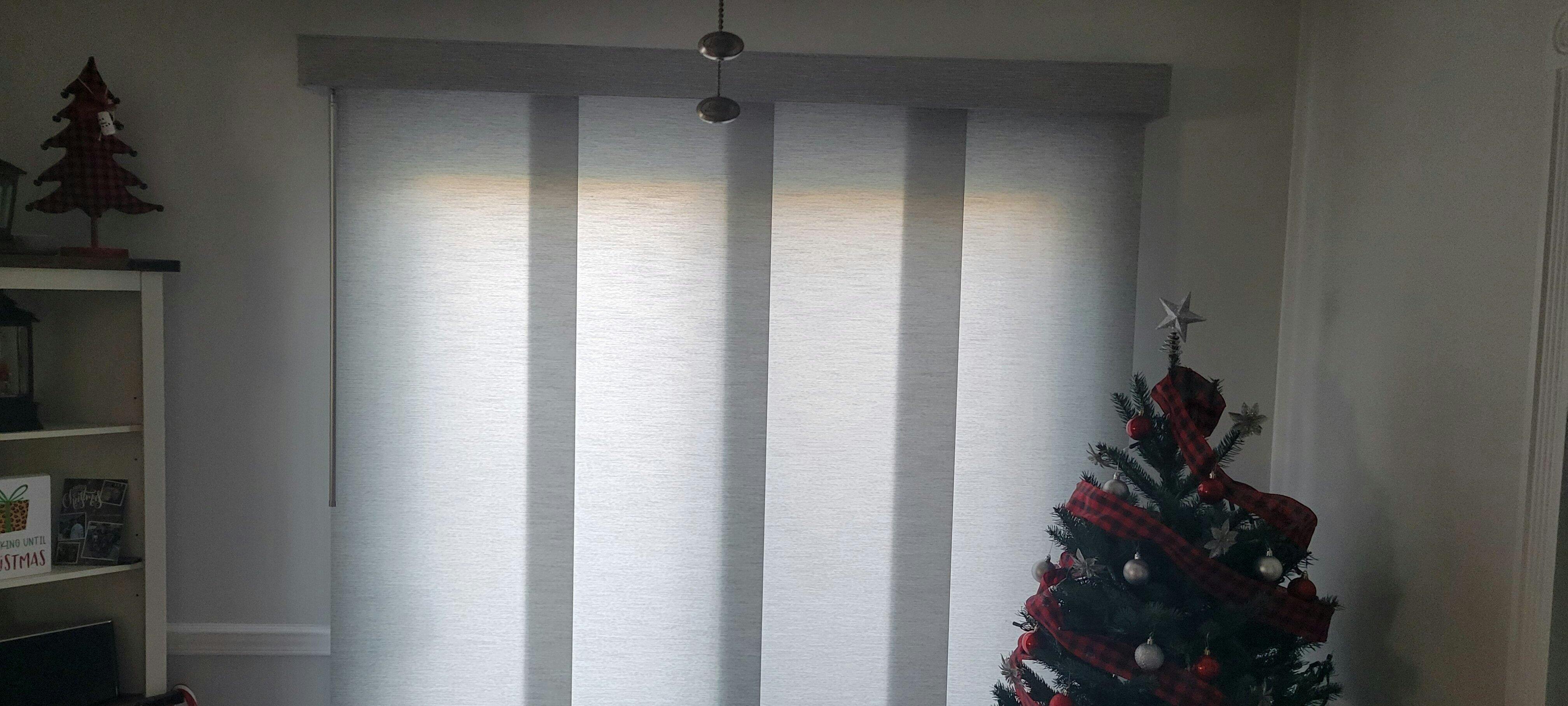
- Match Walls: If you want your windows to recede into the background, matching blinds to the wall color is a great option.
Ultimately, the choice depends on your style goals. Contrasting blinds with trim can also work well in modern spaces.
Coordinating with Furniture Style
- Modern: Opt for neutral tones or bold contrasts (e.g., black blinds against white walls).
- Traditional: Rich, deep colors like burgundy or navy add elegance.
- Rustic/Farmhouse: Earthy tones (beige, olive green) or natural materials work best.
Tying in Flooring and Decor
Your window treatments should complement the floor color and other accents in the room. For example:
- If you have warm-toned hardwood floors, consider blinds in beige or brown hues.
- Use curtains to pick up colors from artwork or throw pillows for a pulled-together look.

How to Choose the Right Window Treatment
Beyond color, consider the following when selecting window treatments:
- Functionality: Do you need light control, privacy, or insulation?
- Style: Blinds, shades, curtains, or shutters? Each offers a different aesthetic.
- Room Purpose: Bedrooms may benefit blackout curtains, while living rooms might suit sheer shades.
How to Pick a Color for Blinds
When choosing a color for blinds, keep these tips in mind:
Sample First:
Always test samples in your home lighting before deciding.
Consider Size:
Light colors make small rooms feel larger; dark colors add coziness to large spaces.
Psychology of Color:
- Blue: Calming and serene—perfect for bedrooms.
- Yellow: Energizing and cheerful—great for kitchens or playrooms.
- Green: Fresh and balanced—ideal for living areas or home offices.
- Neutrals: Versatile and timeless—suitable for any room.
Pro Tips for Using Color Strategically
- Make a Small Room Look Larger: Choose light-colored blinds or curtains that match the wall color. This eliminates visual breaks and expands the space.
- Lower a High Ceiling: Use darker window treatments mounted at the top of the window to draw the eye downward.
- Highlight the Window: Frame your window with bold-colored treatments to make it a focal point.

Why Choose Graywind for Your Window Treatments?
At Graywind, we understand that window treatments are a key element of your home’s design. Our products are crafted with precision and care, offering:
- Premium Quality: Durable materials that stand the test of time.
- Wide Range of Options: From minimalist blinds to custom printed shades, we have something for every style.
- Custom Printed Shades: Looking for something unique? Our printed shades allow you to express your personality with patterns and colors tailored to your taste. Whether you want to match your decor or make a statement, Graywind has you covered.
Explore Graywind today and transform your windows into works of art!